Earthquakes in General
An earthquake (also known as a quake, tremor, or temblor) is the shaking of the Earth’s surface caused by a rapid release of energy in the Earth’s lithosphere, which produces seismic waves. Earthquakes can range in size from those that are so little that they cannot be felt to those that are powerful enough to throw things and people into the air and destroy entire towns. The frequency, kind, and size of earthquakes experienced in a given location are referred to as its seismicity or seismic activity. Non-earthquake seismic rumbling is sometimes referred to as tremor. - Wikipedia.
The Data we are Using
The data used comes from a dataset that I posted to Kaggle and is an updated and enlarged earthquake inventory of earthquakes, exclusively for Greece, dating back to 1965, that will be updated annually with earthquake events from the previous year.
The first column of the dataset is titled ‘DATETIME,’ and it indicates when the earthquake occurred. Then there are the ‘LAT’ (Latitude) and ‘LONG’ (Longitude) coordinates, which tell us where the earthquake occurred. Finally, the earthquake is described by ‘DEPTH’ (km) and ‘MAGNITUDE’ (Richter Scale).
It is available here.
Earthquake Visualization
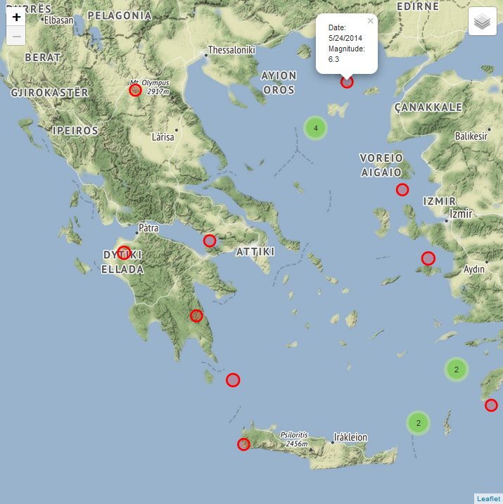
In this section of code, we first import the data from a csv file using the padas library, and then we use the folium library and MarkerCluster to create a map centered in Athens (37.983810, 23.727539), in a 800x800 figure, that displays all earthquakes with a magnitude of 6 Richter and when they occurred.
import pandas as pd
import folium
from folium.plugins import MarkerCluster

data = pd.read_csv("https://www.nickdoulos.com/assets/Earthquakes.csv")

mc = MarkerCluster(name="Marker Cluster")
folium_figure = folium.Figure(width=800, height=800)
folium_map = folium.Map([37.983810, 23.727539],
               zoom_start=7, min_zoom = 7, max_zoom = 12, tiles='Stamen Terrain').add_to(folium_figure)

for index, row in data[data.MAGNITUDE>6].iterrows():
    popup_text = "Date: " + str(row["DATETIME"])[:-5] + "\n Magnitude: "+ str(row['MAGNITUDE'])

    folium.CircleMarker(location=[row["LAT"],row["LONG"]],
                        radius= 1.5 * row['MAGNITUDE'],
                        color="red",
                        popup=popup_text,
                        fill=True).add_to(mc)

mc.add_to(folium_map)
folium.LayerControl().add_to(folium_map)


folium_figure
Earthquake Analysis
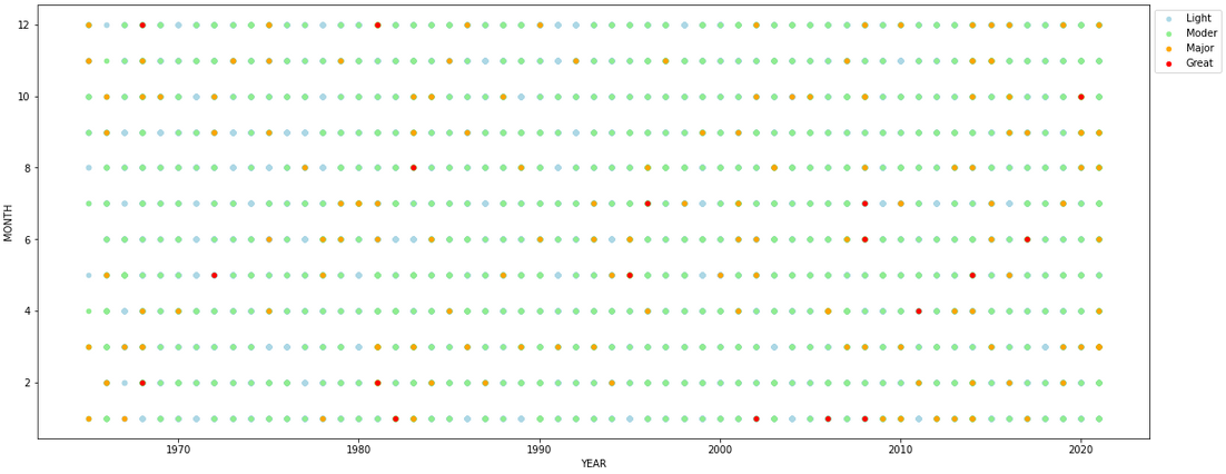
Here, from the DATETIME column, we construct a DAY, MONTH, and YEAR column, and then divide the data into different sets based on their magnitude. We also construct a Year-Month scatter plot, with every earthquake. The orange and red dots show the moderate and majore ones, and lightgreen and lightblue the light (most frequent) and minor ones respectively. We can see that earthquakes continue to occur throughout the years, although the most of them are minor and do not appear to be a concern.
data['DATETIME'] = pd.to_datetime(data['DATETIME'])
data['YEAR'] = data['DATETIME'].dt.year
data['MONTH'] = data['DATETIME'].dt.month
data['DAY'] = data['DATETIME'].dt.day

eq_minor = data.loc[(data['MAGNITUDE'] > 0) & (data['MAGNITUDE'] <=4)]
eq_light = data.loc[(data['MAGNITUDE'] > 4) & (data['MAGNITUDE'] <=5)]
eq_moder = data.loc[(data['MAGNITUDE'] > 5) & (data['MAGNITUDE'] <= 6)]
eq_major = data.loc[(data['MAGNITUDE'] > 6) & (data['MAGNITUDE'] <=7)]

ax1 = eq_minor.plot(kind='scatter', x = 'YEAR', y = 'MONTH', color = 'lightblue', label = 'Light', figsize=(20,8))
ax2 = eq_light.plot(kind='scatter', x = 'YEAR', y = 'MONTH', color = 'lightgreen',  label = 'Moder', ax = ax1)
ax3 = eq_moder.plot(kind='scatter', x = 'YEAR', y = 'MONTH', color = 'orange', label = 'Major', ax = ax1)
ax4 = eq_major.plot(kind='scatter', x = 'YEAR', y = 'MONTH', color = 'r', label = 'Great',  ax = ax1)
ax1.legend(bbox_to_anchor=(1., 1.))
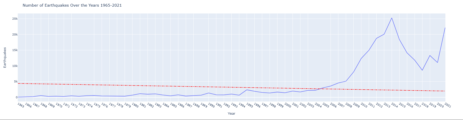
With the aid of the ploty library, we develop a plot that displays the number of earthquakes over time. There has been an upward trend in the overall number of earthquake incidents each year since 2008, with the pinnacle being in the year 2014. We need to look at the mean magnitude over time to understand this tendency.
import plotly.express as ex

tmp = data.groupby(by='YEAR').count()
tmp = tmp.reset_index()[['YEAR','DATETIME']]

fig = ex.line(tmp,x='YEAR',y='DATETIME')

fig.update_layout(title= 'Number of Earthquakes Over the Years 1965-2021',
                  xaxis = dict(tickmode = 'linear', tick0 = 0.0, dtick = 1))

fig.add_shape(type="line",
              x0=tmp['YEAR'].values[0], y0=tmp['DATETIME'].mean(), x1=tmp['YEAR'].values[-1], y1=tmp['YEAR'].mean(),
              line=dict(color="Red", width=2, dash="dashdot"), name='Mean')

fig.update_layout(
    xaxis_title="Year",
    yaxis_title="Earthquakes")

fig.show()
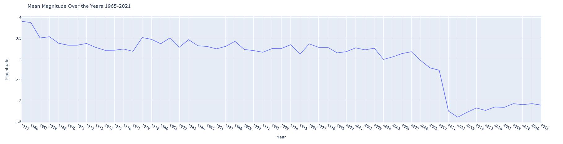
We can clearly notice a dramatic drop in the mean magnitude over the previous 11 years, which might imply the usage of newer and more technologically capable seismometers that can detect earthquakes with considerably lower magnitudes than before, allowing us to identify many more earthquakes.
tmp = data.groupby(by='YEAR').mean()
tmp = tmp.reset_index()[['YEAR','MAGNITUDE']]

fig = ex.line(tmp,x='YEAR',y='MAGNITUDE')

fig.update_layout(
    title= 'Mean Magnitude Over the Years 1965-2021',
    xaxis = dict(tickmode = 'linear', tick0 = 0.0, dtick = 1))

fig.update_layout(
    xaxis_title="Year",
    yaxis_title="Magnitude")

fig.show()
When we look at the magnitude distribution of earthquakes, we can see that most of them follow a bimodal distribution centered around 2.3 richter, with the majority of them occurring around 1.6 and 3 Richter. With the aid of the sns library’s histplot.
import matplotlib.pyplot as plt
import seaborn as sns

plt.figure(figsize=(20,11))
ax = sns.histplot(data['MAGNITUDE'],label='Magnitude',color='teal')
ax.set_title('Distribution Of Earthquake Magnitudes',fontsize=19)
ax.set_ylabel('Density',fontsize=16)
ax.set_xlabel('Magnitude',fontsize=16)

plt.show()

plt.figure(figsize=(20,11))
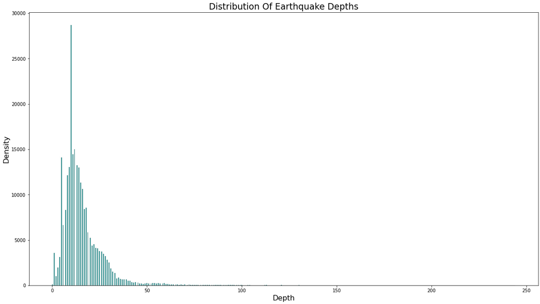
ax = sns.histplot(data['DEPTH'],label='Depth',color='teal')
ax.set_title('Distribution Of Earthquake Depths',fontsize=19)
ax.set_ylabel('Density',fontsize=16)
ax.set_xlabel('Depth',fontsize=16)
plt.show()
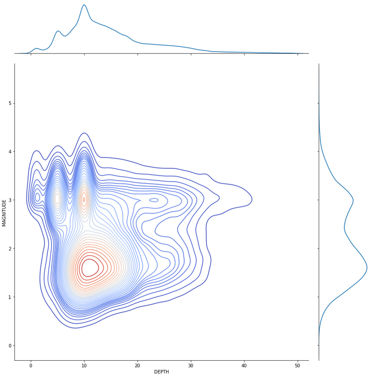
We are “cleaning” the magnitude (less than or equal to 5.5 Richter) and depth (less than 50 kilometres) data from their lengthy “tails” which are designated as black swans. As a result, we can determine that an earthquake will most likely occur at a depth of 11-12 kilometres and a magnitude of 1.6 Richter. Using the jointplot from the sns package.
tmp = data.copy()
tmp = tmp[tmp['MAGNITUDE']<=5.5]
tmp = tmp[tmp['DEPTH']<50]

sns.jointplot(data=tmp,x='DEPTH',y='MAGNITUDE',kind='kde',cmap='coolwarm',height=12,levels=30)
You may see the post on my GitHub Gist here if you want to interact with the map or the figures.